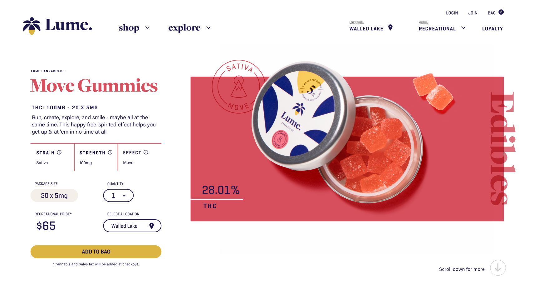
Best-in-Class e-commerce Shopping experience Designed from the ground up
Overview
Lume needed a complete redesign of its outdated website to deliver a best-in-class e-commerce experience that matched the quality of its in-store shopping.
The Problem
The original website struggled with product display, lack of user experience, and outdated technology. Lume executives sought an online experience that captured the richness of its in-store experience.
The Challenge
Presenting complex product information clearly while replicating the immersive, high-quality in-store experience online.
The Solution
We prioritized and delivered a best-in-class e-commerce platform streamlining key mobile and desktop interactions. This includes: clear navigation, enhanced product marketing cards, seamless add to cart and checkout, account creation, loyalty program, giving the audience an informed shopping experience.
The Impact
The redesign resulted in nearly $200 million in growth, establishing Lume as a leading cannabis retailer.
quick view: context & clarity
Click thumbs to zoom
Lume Executives: 'We've Never Seen Anything Like This'
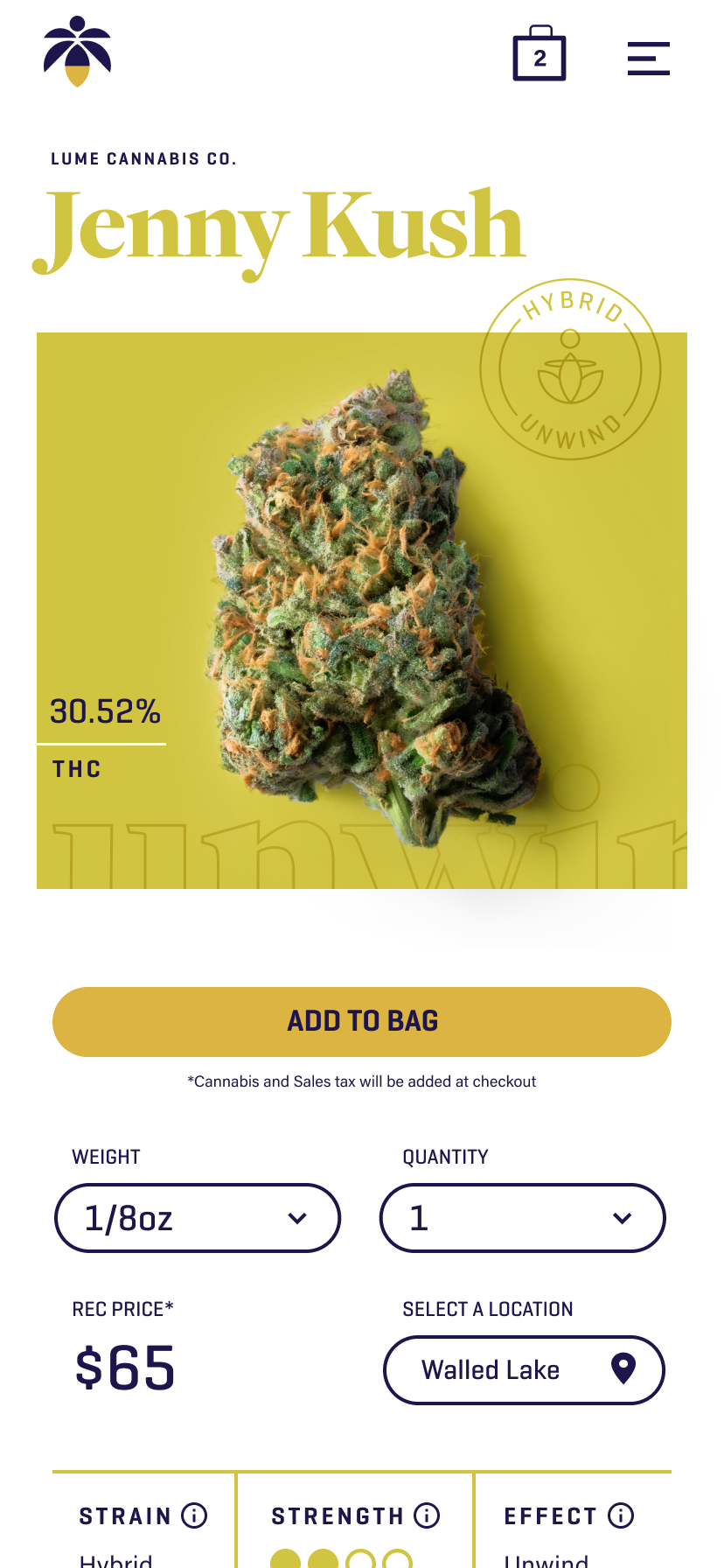
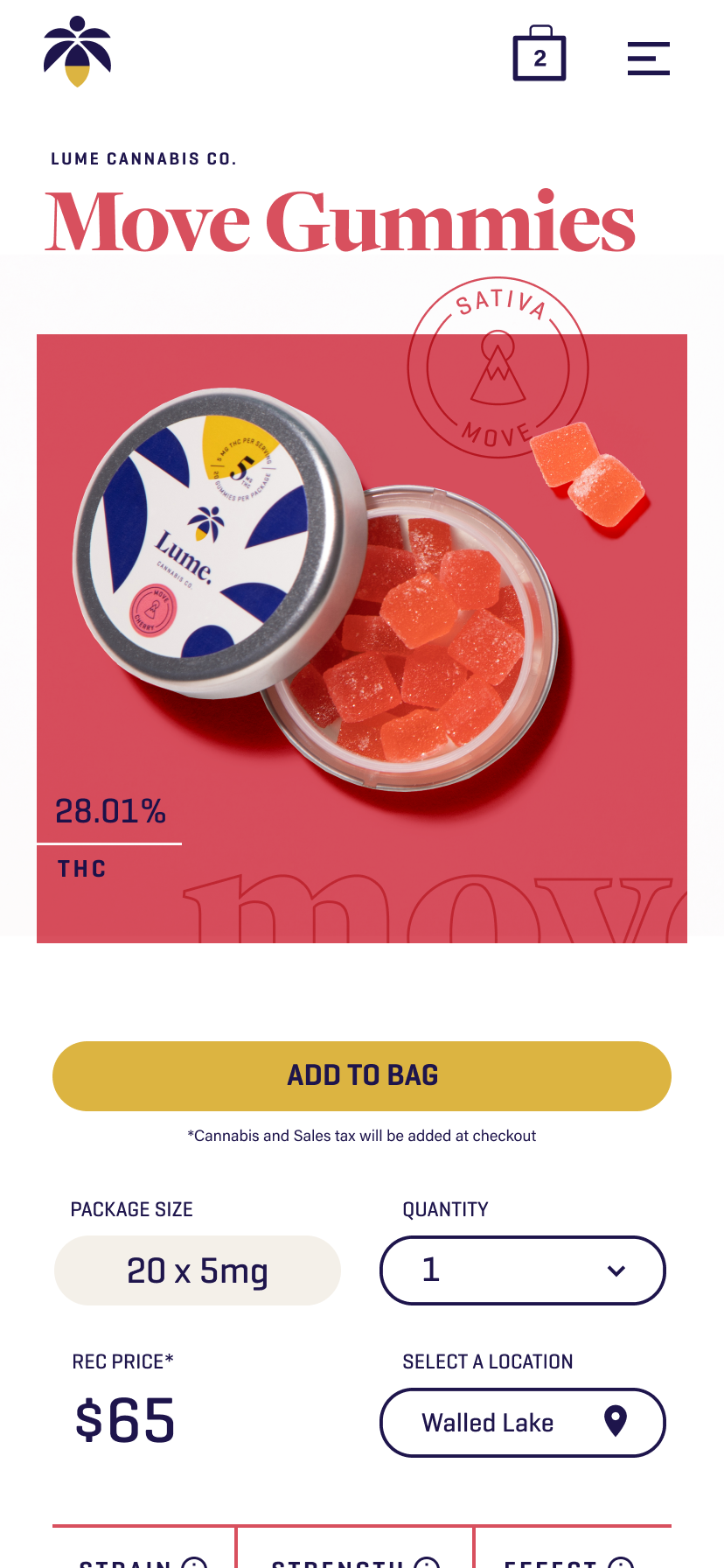
All The Info You’d Get In-Store
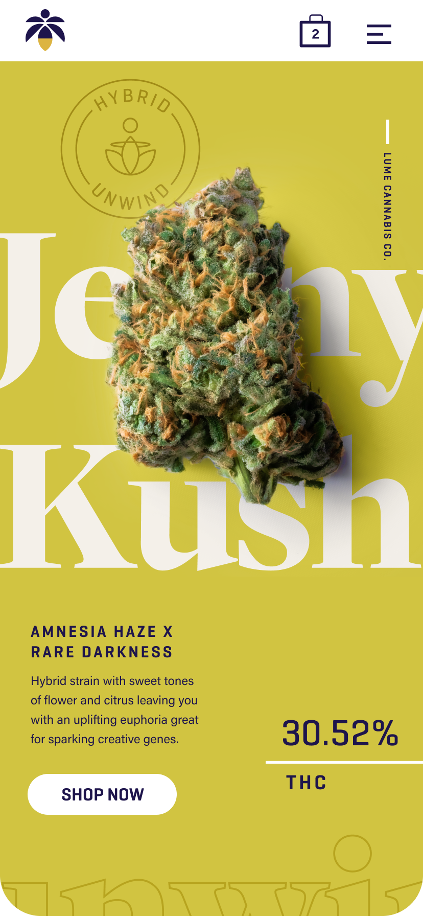
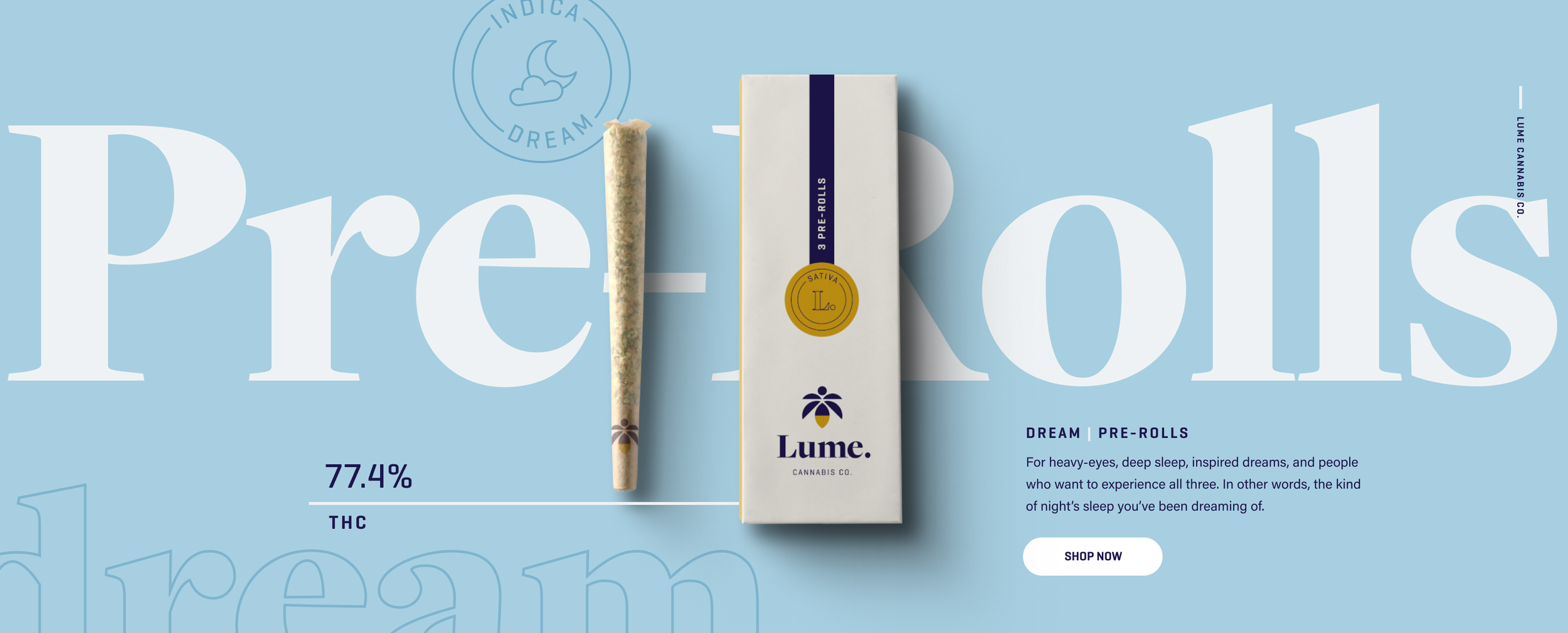
The visual design effectively presents complex information without overwhelming the audience. We overlaid product images onto their corresponding product or category names, using color backgrounds to create clear associations—a unique approach that Lume executives loved and hadn't seen before.
Key mobile interaction
Seamless Checkout for Returning Customers
One-Click Buying
Customers can effortlessly select products and complete their checkout with minimal resistance, greatly enhancing their shopping journey.
The process
Framework guiding us during each sprint
The process of finding and solving problems
Double Diamond Methodology
Divided into four phases which consists of two different types of thinking, divergent and convergent thinking. From exploring an issue more widely to distilling the challenge concisely.
archetype & user JOURNEY’S
Click thumbs to zoom
Improving The Customer Experience Throughout Their Journey
Identified opportunities of what customers really care about. We focused on the most impactful interactions that would help distinguish Lume from others.
Archetype flows, future state SITEMAP, Ecosystem
Organize Content In A Way That Makes Sense For All
One of the problems with the previous site was a difficult navigation and the information architecture was complicated. We re-thought the global navigation and organized content in systematic way that allowed any customer and their specific needs the best experience possible.
synthesis - design research
Discovery Insights
Through divergent and convergent thinking, we synthesized our research findings into categories to plot a meaningful path forward. Prioritizing these ideas and features based on their UX impact. Then used the most impactful and valuable findings to build and pressure test our prototype.
guided experience
Biggest opportunity to reach new customers
Personalized For New & Seasoned Customers
Through a few simple questions, we'll get customers to relevant content without overwhelming them. This will eliminate confusion for customers that don’t know where to start.