
WHAT I DID
Brought leadership’s vision to life unifying the user interface and brand storytelling into a cohesive system
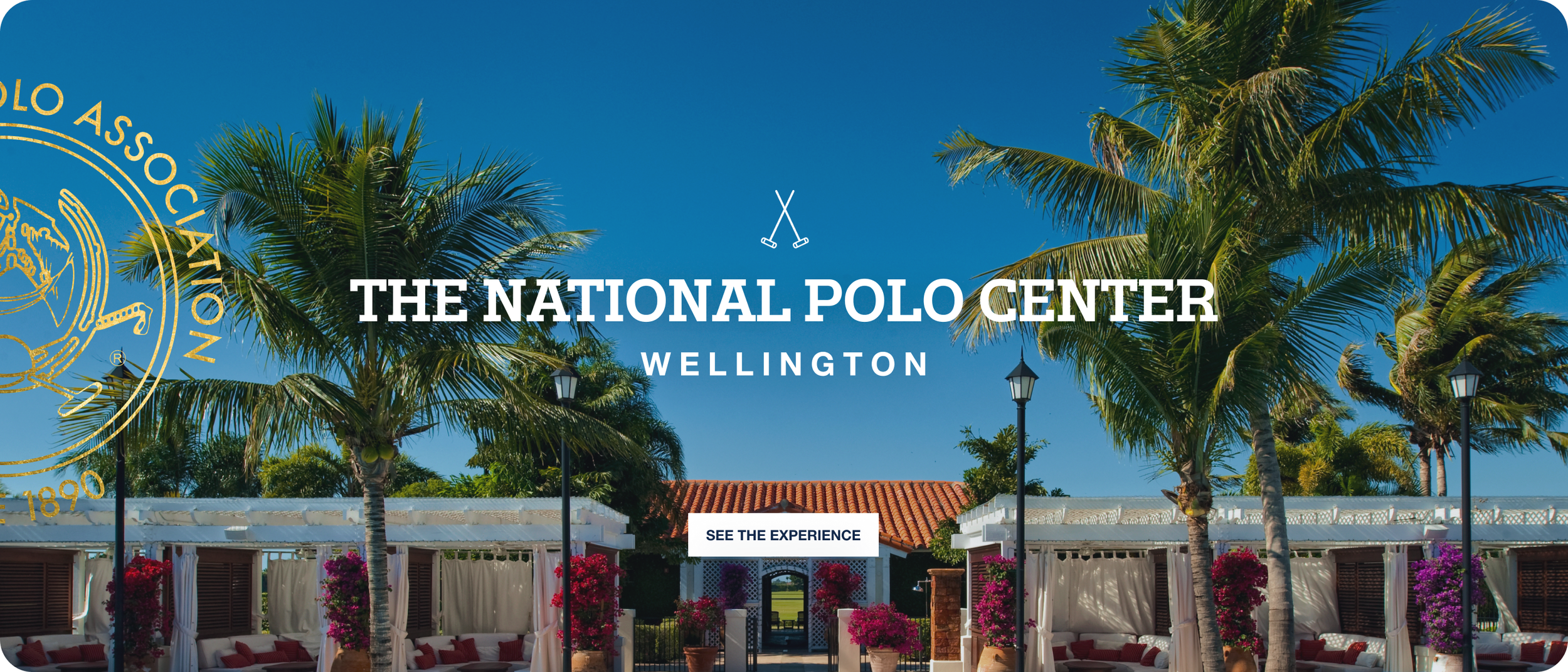
OVERVIEW
A global commerce experience designed to encourage exploration and engagement
CHALLENGE
The brand’s digital experience was fragmented, making exploration feel inconsistent

IMPACT
50%
increase in first-time engagement40%
increase in returning visitors1.4%
decrease in bounce rate“Looking forward to the finished product. Great work all.”
RESEARCH INSIGHTS
Aligned stakeholders on a shared vision using best-in-class sports and culture references
WE FOUND, WE PRIORITIZED
Reorganized content architecture for clarity
Elevated matches, scores, stats, and live context
Reduced noise
Aligned imagery to build trust


scalable
Enhancing match engagement with real-time precision
WE DELIVERED
Live streams with real-time updates
Newsfeed and match content in one view
Easier-to-read scores and player info


storytelling
The brand’s new home modernized without losing its legacy
THE system
Heritage, made present
A living system for a legacy brand
Reframing a legacy brand through place
LESSONS LEARNED
A scalable system is what allows brand and interface to work in concert
THE OUTCOME
Homepage now feels premium and unified
Mobile is easy to tap, scroll, and explore
Modular design speeds up internal workflow
Let’s build what’s next — together
Client — U.S. Polo Association
Role — UX, design lead
Services — UX strategy, design systems, interaction design, storytelling